Introduction
Templora brings you modern, premium UI components that you won’t find anywhere else.
Clean, responsive, and beautifully designed elements you can instantly copy and use in any project—built using
pure HTML, CSS, Bootstrap, and JavaScript.
Build faster. Look professional. Every time.
Installation
Add Templora using CDN or install it manually.
Apple-Style Feature Cards
Clean, elegant & modern feature cards inspired by Apple’s UI design.
⚡
Fast Performance
A smooth and optimized user experience with ultra-clean UI components.
🎨
Modern Design
Carefully crafted visuals with perfect spacing and beautiful typography.
🔒
Secure & Reliable
Built with clean HTML, CSS & JS to ensure full stability and consistency.
<section class="apple-features">

  <div class="apple-card">
    <div class="icon-wrap">
      <span class="icon">⚡</span>
    </div>
    <h3>Fast Performance</h3>
    <p>A smooth and optimized user experience with ultra-clean UI components.</p>
  </div>

  <div class="apple-card">
    <div class="icon-wrap">
      <span class="icon">🎨</span>
    </div>
    <h3>Modern Design</h3>
    <p>Carefully crafted visuals with perfect spacing and beautiful typography.</p>
  </div>

  <div class="apple-card">
    <div class="icon-wrap">
      <span class="icon">🔒</span>
    </div>
    <h3>Secure & Reliable</h3>
    <p>Built with clean HTML, CSS & JS to ensure full stability and consistency.</p>
  </div>

</section>
.apple-features {
  display: grid;
  grid-template-columns: repeat(auto-fit, minmax(240px, 1fr));
  gap: 24px;
}

.apple-card {
  background: #ffffff;
  border-radius: 20px;
  padding: 32px 26px;
  text-align: center;
  border: 1px solid #e4e4e7;
  transition: 0.3s ease;
  cursor: pointer;
  box-shadow: 0 4px 12px rgba(0,0,0,0.04);
}

.apple-card:hover {
  transform: translateY(-6px);
  box-shadow: 0 8px 24px rgba(0,0,0,0.08);
}

.icon-wrap {
  width: 64px;
  height: 64px;
  background: linear-gradient(135deg, #f1f1f5, #f9f9fa);
  border-radius: 50%;
  display: flex;
  align-items: center;
  justify-content: center;
  margin: auto;
  border: 1px solid #e8e8ea;
  box-shadow: inset 0 2px 4px rgba(0,0,0,0.06);
}

.icon {
  font-size: 26px;
}

.apple-card h3 {
  margin-top: 20px;
  font-size: 20px;
  font-weight: 700;
  color: #111;
}

.apple-card p {
  margin-top: 10px;
  font-size: 15px;
  color: #555;
  line-height: 1.5;
}

.apple-demo {
  background: transparent !important;
  padding: 0 !important;
}
// No JavaScript required for Apple-Style Feature Cards,
// but provided for consistency with format.
console.log("Apple Feature Cards Loaded");
Apple-Style Stats Bar
Clean and minimal stats section inspired by Apple’s product pages.
<section class="apple-stats">

  <div class="stat-box">
    <h3>4.8★</h3>
    <p>Average Rating</p>
  </div>

  <div class="stat-box">
    <h3>12k+</h3>
    <p>Monthly Users</p>
  </div>

  <div class="stat-box">
    <h3>98%</h3>
    <p>Satisfaction Rate</p>
  </div>

  <div class="stat-box">
    <h3>35+</h3>
    <p>Premium Components</p>
  </div>

</section>
.apple-stats {
  width: 100%;
  background: #ffffff;
  border-radius: 20px;
  padding: 32px;
  display: flex;
  justify-content: space-between;
  gap: 20px;
  border: 1px solid #e6e6e9;
  box-shadow: 0 6px 20px rgba(0,0,0,0.04);
}

.stat-box {
  flex: 1;
  text-align: center;
  padding: 12px;
  border-right: 1px solid #e6e6e9;
  cursor: pointer;
  transition: 0.3s ease;
}

.stat-box:last-child {
  border-right: none;
}

.stat-box h3 {
  font-size: 32px;
  font-weight: 800;
  color: #111;
}

.stat-box p {
  margin-top: 6px;
  font-size: 14px;
  color: #676767;
}

.stat-box:hover {
  transform: translateY(-4px);
  text-shadow: 0 1px 1px rgba(0,0,0,0.05);
}

.apple-stats-demo {
  background: transparent !important;
  padding: 0 !important;
}

/* Responsive */
@media (max-width: 768px) {
  .apple-stats {
    flex-direction: column;
    gap: 16px;
  }
  .stat-box {
    border-right: none;
    border-bottom: 1px solid #e6e6e9;
    padding-bottom: 16px;
  }
  .stat-box:last-child {
    border-bottom: none;
  }
}
// No JavaScript required for Apple-Style Stats,
// added only to match the component format.
console.log("Apple Stats Loaded");
Apple-Style Pricing Table
Elegant, clean and perfectly spaced pricing cards inspired by Apple’s UI design.
Starter
₹199/mo
Basic Components
Email Support
Regular Updates
Choose Plan
Most Popular
Professional
₹499/mo
Premium Components
Priority Support
Exclusive Sections
Choose Plan
Ultimate
₹899/mo
All Components
Lifetime Updates
VIP Support
Choose Plan
<section class="apple-pricing">

  <div class="pricing-card">
    <h3 class="plan">Starter</h3>
    <p class="price">₹199<span>/mo</span></p>
    <ul class="features">
      <li>Basic Components</li>
      <li>Email Support</li>
      <li>Regular Updates</li>
    </ul>
    <button class="pricing-btn">Choose Plan</button>
  </div>

  <div class="pricing-card popular">
    <div class="tag">Most Popular</div>
    <h3 class="plan">Professional</h3>
    <p class="price">₹499<span>/mo</span></p>
    <ul class="features">
      <li>Premium Components</li>
      <li>Priority Support</li>
      <li>Exclusive Sections</li>
    </ul>
    <button class="pricing-btn highlight">Choose Plan</button>
  </div>

  <div class="pricing-card">
    <h3 class="plan">Ultimate</h3>
    <p class="price">₹899<span>/mo</span></p>
    <ul class="features">
      <li>All Components</li>
      <li>Lifetime Updates</li>
      <li>VIP Support</li>
    </ul>
    <button class="pricing-btn">Choose Plan</button>
  </div>

</section>
.apple-pricing {
  display: grid;
  grid-template-columns: repeat(auto-fit, minmax(260px, 1fr));
  gap: 28px;
  padding: 20px 0;
}

.pricing-card {
  background: #ffffff;
  border-radius: 18px;
  padding: 32px 24px;
  border: 1px solid #e5e5e7;
  text-align: center;
  box-shadow: 0 4px 18px rgba(0,0,0,0.04);
  transition: 0.3s ease;
}

.pricing-card:hover {
  transform: translateY(-6px);
  box-shadow: 0 6px 24px rgba(0,0,0,0.08);
}

.plan {
  font-size: 20px;
  font-weight: 700;
  color: #111;
}

.price {
  font-size: 38px;
  font-weight: 800;
  margin-top: 8px;
  color: #111;
}

.price span {
  font-size: 16px;
  color: #555;
  margin-left: 2px;
}

.features {
  list-style: none;
  padding: 0;
  margin: 20px 0;
}

.features li {
  font-size: 15px;
  color: #555;
  padding: 6px 0;
  border-bottom: 1px solid #f0f0f2;
}

.features li:last-child {
  border-bottom: none;
}

/* Buttons */
.pricing-btn {
  margin-top: 16px;
  padding: 12px 20px;
  width: 100%;
  border-radius: 12px;
  border: none;
  cursor: pointer;
  font-weight: 600;
  background: #f5f5f7;
  color: #111;
  transition: 0.3s;
}

.pricing-btn:hover {
  background: #eaeaea;
}

/* Highlighted (popular plan) */
.popular {
  border: 1.5px solid #6f00ff;
  box-shadow: 0 0 0 3px rgba(111,0,255,0.08);
}

.tag {
  background: #6f00ff;
  color: #fff;
  padding: 6px 12px;
  font-size: 12px;
  border-radius: 30px;
  display: inline-block;
  margin-bottom: 12px;
}

.highlight {
  background: linear-gradient(90deg,#6f00ff,#ff00e6);
  color: #fff !important;
  box-shadow: 0 6px 24px rgba(111,0,255,0.18);
}

.highlight:hover {
  opacity: 0.9;
}

.pricing-demo {
  background: transparent !important;
  padding: 0 !important;
}
// No JavaScript needed for Apple Pricing Table,
// included just to maintain component format.
console.log("Apple Pricing Table Loaded");
Copyable API Endpoint Cards
Clean developer-friendly API endpoint cards with method badge and one-click copy.
GET
/api/users
Copy
POST
/api/register
Copy
PUT
/api/profile
Copy
<section class="api-endpoints">

  <div class="api-card">
    <span class="method get">GET</span>
    <span class="endpoint">/api/users</span>
    <button class="copy-endpoint">Copy</button>
  </div>

  <div class="api-card">
    <span class="method post">POST</span>
    <span class="endpoint">/api/register</span>
    <button class="copy-endpoint">Copy</button>
  </div>

  <div class="api-card">
    <span class="method put">PUT</span>
    <span class="endpoint">/api/profile</span>
    <button class="copy-endpoint">Copy</button>
  </div>

</section>
.api-endpoints {
  display: flex;
  flex-direction: column;
  gap: 14px;
}

.api-card {
  display: flex;
  align-items: center;
  gap: 14px;
  background: #0f172a;
  border: 1px solid #1e293b;
  padding: 14px 16px;
  border-radius: 12px;
  color: #fff;
  font-family: monospace;
}

.method {
  padding: 4px 10px;
  border-radius: 6px;
  font-size: 12px;
  font-weight: 600;
}

.get { background: #16a34a; }
.post { background: #2563eb; }
.put { background: #f59e0b; }

.endpoint {
  flex: 1;
  opacity: 0.9;
}

.copy-endpoint {
  background: #111827;
  border: 1px solid #374151;
  color: #fff;
  padding: 6px 12px;
  border-radius: 8px;
  cursor: pointer;
  transition: 0.2s;
}

.copy-endpoint:hover {
  background: #1f2937;
}
function copyText(text) {
  navigator.clipboard.writeText(text);
  alert("Endpoint copied!");
}
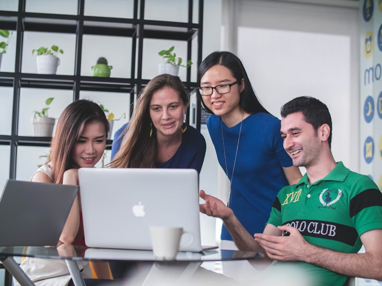
About Us
A clean, modern about section with image, text and highlight features.
We Build Modern UI Components
Templora provides premium, clean and ready-to-use UI components that help developers build beautiful
websites faster.
Every design is created with attention to detail, perfect spacing, and modern UI trends.
Learn More
<section class="about-section">

  <div class="about-image">
    <img src="IMAGE-PATH-HERE" alt="About Image">
  </div>

  <div class="about-content">
    <h3>We Build Modern UI Components</h3>

    <p>
      Templora provides premium, clean and ready-to-use UI components that help developers build beautiful websites faster.
    </p>

    <ul class="about-points">
      <li><i class="bi bi-check2-circle"></i> Premium handcrafted components</li>
      <li><i class="bi bi-check2-circle"></i> 100% responsive & modern design</li>
      <li><i class="bi bi-check2-circle"></i> Easy copy-paste integration</li>
    </ul>

    <a href="#" class="about-btn">Learn More</a>
  </div>

</section>
/* ABOUT SECTION */
.about-section {
  display: grid;
  grid-template-columns: 1fr 1fr;
  gap: 40px;
  align-items: center;
  max-width: 1100px;
  margin: auto;
  padding: 40px 0;
}

/* IMAGE */
.about-image img {
  width: 100%;
  border-radius: 18px;
  box-shadow: 0 12px 28px rgba(0,0,0,0.08);
  transition: 0.3s ease;
}

.about-image img:hover {
  transform: scale(1.02);
}

/* CONTENT */
.about-content h3 {
  font-size: 28px;
  font-weight: 800;
  color: #111;
  margin-bottom: 12px;
}

.about-content p {
  color: #555;
  margin-bottom: 18px;
  line-height: 1.6;
}

/* HIGHLIGHT POINTS */
.about-points {
  list-style: none;
  padding: 0;
  margin-bottom: 20px;
}

.about-points li {
  font-size: 15px;
  color: #444;
  margin-bottom: 10px;
  display: flex;
  align-items: center;
  gap: 8px;
}

.about-points i {
  color: #6f00ff;
  font-size: 18px;
}

/* BUTTON */
.about-btn {
  display: inline-block;
  background: #6f00ff;
  color: #fff;
  padding: 12px 24px;
  border-radius: 12px;
  font-weight: 600;
  text-decoration: none;
  transition: 0.3s ease;
}

.about-btn:hover {
  opacity: 0.9;
}

/* RESPONSIVE */
@media (max-width: 768px) {
  .about-section {
    grid-template-columns: 1fr;
    text-align: center;
  }
  .about-points li {
    justify-content: center;
  }
}
// No JS required for this section
console.log("About Section Loaded");
Advanced Premium Navbar
A modern animated navbar with mobile menu and hover effects.
<nav class="advanced-navbar">
  <div class="nav-logo">Templora</div>

  <ul class="nav-links">
    <li><a href="#">Home</a></li>
    <li><a href="#">Components</a></li>
    <li><a href="#">Templates</a></li>
    <li><a href="#">Updates</a></li>
  </ul>

  <div class="nav-actions">
    <i class="bi bi-search nav-search"></i>
    <button class="nav-btn">Get Started</button>
    <i class="bi bi-list mobile-menu-icon" id="openMenu"></i>
  </div>
</nav>

<!-- MOBILE MENU -->
<div class="mobile-menu" id="mobileMenu">
  <i class="bi bi-x-lg close-menu" id="closeMenu"></i>

  <a href="#">Home</a>
  <a href="#">Components</a>
  <a href="#">Templates</a>
  <a href="#">Updates</a>

  <button class="mobile-btn">Get Started</button>
</div>
<style>

/* NAVBAR */
.advanced-navbar {
  width: 100%;
  padding: 14px 30px;
  display: flex;
  justify-content: space-between;
  align-items: center;
  background: rgba(255,255,255,0.2);
  backdrop-filter: blur(12px);
  border-radius: 18px;
  border: 1px solid rgba(255,255,255,0.35);
  box-shadow: 0 8px 25px rgba(0,0,0,0.1);
}

/* LOGO */
.nav-logo {
  font-size: 22px;
  font-weight: 800;
  color: #111;
}

/* LINKS */
.nav-links {
  display: flex;
  align-items: center;
  gap: 28px;
  list-style: none;
}

.nav-links a {
  text-decoration: none;
  font-weight: 600;
  color: #333;
  position: relative;
  transition: 0.3s ease;
}

/* Hover underline */
.nav-links a::after {
  content: "";
  position: absolute;
  left: 0;
  bottom: -4px;
  width: 0%;
  height: 2px;
  background: #6f00ff;
  transition: 0.3s ease;
}

.nav-links a:hover::after {
  width: 100%;
}

/* CTA Button */
.nav-btn {
  background: linear-gradient(135deg,#6f00ff,#ff00c8);
  border: none;
  color: white;
  padding: 10px 18px;
  border-radius: 12px;
  cursor: pointer;
  font-weight: 600;
  transition: 0.25s ease;
}

.nav-btn:hover {
  opacity: 0.85;
}

/* Search icon */
.nav-search {
  font-size: 22px;
  margin-right: 18px;
  cursor: pointer;
  color: #6f00ff;
}

/* Menu icon */
.mobile-menu-icon {
  display: none;
  font-size: 26px;
  cursor: pointer;
}

/* MOBILE MENU */
.mobile-menu {
  position: fixed;
  top: 0;
  right: -100%;
  width: 70%;
  height: 100vh;
  background: #fff;
  box-shadow: -6px 0 20px rgba(0,0,0,0.1);
  padding: 30px 20px;
  display: flex;
  flex-direction: column;
  gap: 20px;
  transition: 0.3s ease;
  z-index: 999;
}

.mobile-menu a {
  font-size: 18px;
  text-decoration: none;
  color: #333;
  font-weight: 600;
}

.mobile-btn {
  background: linear-gradient(135deg,#6f00ff,#ff00c8);
  color: #fff;
  padding: 12px;
  border: none;
  border-radius: 12px;
  font-weight: 600;
}

.close-menu {
  font-size: 26px;
  align-self: flex-end;
  margin-bottom: 10px;
  cursor: pointer;
}

/* RESPONSIVE */
@media (max-width: 820px) {
  .nav-links {
    display: none;
  }

  .nav-btn {
    display: none;
  }

  .mobile-menu-icon {
    display: block;
  }
}

</style>
<nav class="advanced-navbar">
  <div class="nav-logo">Templora</div>

  <ul class="nav-links">
    <li><a href="#">Home</a></li>
    <li><a href="#">Components</a></li>
    <li><a href="#">Templates</a></li>
    <li><a href="#">Updates</a></li>
  </ul>

  <div class="nav-actions">
    <i class="bi bi-search nav-search"></i>
    <button class="nav-btn">Get Started</button>
    <i class="bi bi-list mobile-menu-icon" id="openMenu"></i>
  </div>
</nav>

<!-- MOBILE MENU -->
<div class="mobile-menu" id="mobileMenu">
  <i class="bi bi-x-lg close-menu" id="closeMenu"></i>

  <a href="#">Home</a>
  <a href="#">Components</a>
  <a href="#">Templates</a>
  <a href="#">Updates</a>

  <button class="mobile-btn">Get Started</button>
</div>
Before / After Comparison Slider
Drag the handle to compare two images with a smooth interactive
slider.
<div class="compare-container">

  <div class="compare-image before">
    <img src="https://via.placeholder.com/900x500?text=Before+Design" alt="Before">
  </div>

  <div class="compare-image after">
    <img src="https://via.placeholder.com/900x500?text=After+Design" alt="After">
  </div>

  <div class="compare-handle"></div>

</div>
/* Container */
.compare-container {
  position: relative;
  max-width: 900px;
  margin: auto;
  height: 500px;
  border-radius: 18px;
  overflow: hidden;
  cursor: ew-resize;
  box-shadow: 0 14px 40px rgba(0,0,0,0.12);
}

/* Images */
.compare-image {
  position: absolute;
  top: 0;
  left: 0;
  width: 100%;
  height: 100%;
}

.compare-image img {
  width: 100%;
  height: 100%;
  object-fit: cover;
}

/* Before full */
.compare-image.before {
  z-index: 1;
}

/* After clipped */
.compare-image.after {
  z-index: 2;
  width: 50%;
  overflow: hidden;
}

/* Handle */
.compare-handle {
  position: absolute;
  top: 0;
  left: 50%;
  width: 4px;
  height: 100%;
  background: #ffffff;
  z-index: 3;
  transform: translateX(-50%);
}

.compare-handle::before {
  content: '';
  position: absolute;
  top: 50%;
  left: 50%;
  width: 36px;
  height: 36px;
  background: #6f00ff;
  border-radius: 50%;
  transform: translate(-50%, -50%);
  box-shadow: 0 0 0 6px rgba(111,0,255,0.25);
}
// Before After Slider Logic
(function () {
  const container = document.querySelector(".compare-container");
  const afterImg = document.querySelector(".compare-image.after");
  const handle = document.querySelector(".compare-handle");

  let dragging = false;

  function moveSlider(x) {
    const rect = container.getBoundingClientRect();
    let pos = x - rect.left;
    pos = Math.max(0, Math.min(pos, rect.width));

    const percent = (pos / rect.width) * 100;
    afterImg.style.width = percent + "%";
    handle.style.left = percent + "%";
  }

  // Mouse
  container.addEventListener("mousedown", () => dragging = true);
  window.addEventListener("mouseup", () => dragging = false);
  window.addEventListener("mousemove", e => dragging && moveSlider(e.clientX));

  // Touch
  container.addEventListener("touchstart", () => dragging = true);
  window.addEventListener("touchend", () => dragging = false);
  window.addEventListener("touchmove", e => {
    if (dragging) moveSlider(e.touches[0].clientX);
  });
})();
Cursor Follow Gradient
A luxury interactive section where a glowing gradient follows the
cursor.
Premium Interactive Experience
Move your mouse around to feel the smooth gradient interaction.
Get Started
<div class="cursor-section">

  <div class="cursor-gradient"></div>

  <div class="cursor-content">
    <h3>Premium Interactive Experience</h3>
    <p>Move your mouse around to feel the smooth gradient interaction.</p>
    <button class="cursor-btn">Get Started</button>
  </div>

</div>
/* Section */
.cursor-section {
  position: relative;
  height: 320px;
  border-radius: 20px;
  overflow: hidden;
  background: #0f0f1a;
  display: flex;
  align-items: center;
  justify-content: center;
}

/* Gradient Blob */
.cursor-gradient {
  position: absolute;
  width: 260px;
  height: 260px;
  background: radial-gradient(circle at center, #6f00ff, #ff00c8, transparent 60%);
  filter: blur(60px);
  opacity: 0.9;
  pointer-events: none;
  transform: translate(-50%, -50%);
  transition: transform 0.05s linear;
}

/* Content */
.cursor-content {
  position: relative;
  text-align: center;
  color: #fff;
  z-index: 2;
}

.cursor-content h3 {
  font-size: 26px;
  margin-bottom: 8px;
}

.cursor-content p {
  font-size: 14px;
  opacity: 0.85;
  margin-bottom: 16px;
}

/* Button */
.cursor-btn {
  padding: 10px 22px;
  background: #ffffff;
  color: #111;
  border: none;
  border-radius: 999px;
  font-weight: 600;
  cursor: pointer;
}
// Cursor Follow Gradient Logic
(function () {
  const section = document.querySelector(".cursor-section");
  const gradient = document.querySelector(".cursor-gradient");

  section.addEventListener("mousemove", (e) => {
    const rect = section.getBoundingClientRect();
    const x = e.clientX - rect.left;
    const y = e.clientY - rect.top;

    gradient.style.transform =
      "translate(" + x + "px, " + y + "px)";
  });
})();
Cyberpunk Navbar
A futuristic neon glowing navigation bar with animated highlight
effects.
<nav class="cyber-nav">
  <div class="nav-logo">
    <span class="glitch">Templora</span>
  </div>

  <ul class="nav-links">
    <li><a href="#">Home</a></li>
    <li><a href="#">Components</a></li>
    <li><a href="#">Pricing</a></li>
    <li><a href="#">Docs</a></li>
  </ul>

  <button class="cyber-btn">Launch</button>
</nav>
.cyber-nav {
  width: 100%;
  padding: 18px 35px;
  background: rgba(10, 10, 10, 0.85);
  border: 2px solid #8f00ff;
  border-radius: 14px;
  display: flex;
  justify-content: space-between;
  align-items: center;
  box-shadow: 0 0 35px #8f00ff55;
  position: relative;
  overflow: hidden;
}

/* Neon Accent Line */
.cyber-nav::before {
  content: "";
  position: absolute;
  top: 0;
  left: -100%;
  width: 100%;
  height: 3px;
  background: linear-gradient(90deg, transparent, #ff00e6, #00eaff, transparent);
  animation: scan 4s linear infinite;
}
@keyframes scan {
  0% { left: -100%; }
  100% { left: 100%; }
}

/* Logo */
.glitch {
  font-size: 26px;
  font-weight: 800;
  color: #fff;
  text-shadow: 0 0 10px #ff00e6, 0 0 20px #00eaff;
}

/* Nav Links */
.nav-links {
  display: flex;
  gap: 25px;
  list-style: none;
}
.nav-links a {
  color: #e0e0e0;
  font-size: 16px;
  font-weight: 500;
  position: relative;
  transition: 0.3s ease;
}
.nav-links a:hover {
  color: #00eaff;
}
.nav-links a::after {
  content: "";
  width: 0%;
  height: 2px;
  background: #00eaff;
  position: absolute;
  left: 0;
  bottom: -4px;
  transition: 0.3s;
}
.nav-links a:hover::after {
  width: 100%;
}

/* Cyberpunk Button */
.cyber-btn {
  padding: 10px 24px;
  background: transparent;
  border: 2px solid #ff00e6;
  color: #fff;
  border-radius: 8px;
  font-size: 15px;
  cursor: pointer;
  transition: 0.3s ease;
  position: relative;
  overflow: hidden;
}
.cyber-btn:hover {
  background: #ff00e633;
  box-shadow: 0 0 18px #ff00e6;
}
.cyber-btn::before {
  content: "";
  width: 120%;
  height: 120%;
  background: linear-gradient(
    120deg,
    transparent,
    rgba(255, 0, 230, 0.4),
    transparent
  );
  position: absolute;
  top: -100%;
  left: -20%;
  transform: rotate(25deg);
  animation: shine 2.5s infinite ease-in-out;
}
@keyframes shine {
  0% { top: -120%; }
  100% { top: 120%; }
}
document.querySelector(".cyber-nav").addEventListener("mousemove", () => {
  document.querySelector(".cyber-nav").style.transform = "scale(1.01)";
});
document.querySelector(".cyber-nav").addEventListener("mouseleave", () => {
  document.querySelector(".cyber-nav").style.transform = "scale(1)";
});
Hover Reveal Card Grid
Premium Netflix-style expanding cards with smooth hover animations.
Modern UI Kits
Build beautiful interfaces with ready-made premium components.
Templates
High-quality HTML templates for startups, portfolios, and more.
Animations
Enhance UX with smooth CSS & JS animations.
<div class="reveal-grid">

  <div class="reveal-card">
    <img src="https://via.placeholder.com/400x250" alt="">
    <div class="reveal-content">
      <h3>Modern UI Kits</h3>
      <p>Build beautiful interfaces with ready-made premium components.</p>
    </div>
  </div>

  <div class="reveal-card">
    <img src="https://via.placeholder.com/400x250" alt="">
    <div class="reveal-content">
      <h3>Templates</h3>
      <p>High-quality HTML templates for startups and portfolios.</p>
    </div>
  </div>

  <div class="reveal-card">
    <img src="https://via.placeholder.com/400x250" alt="">
    <div class="reveal-content">
      <h3>Animations</h3>
      <p>Enhance UX with smooth CSS & JS animations.</p>
    </div>
  </div>

</div>
/* Grid Layout */
.reveal-grid {
  display: grid;
  grid-template-columns: repeat(auto-fit, minmax(260px, 1fr));
  gap: 26px;
  max-width: 1100px;
  margin: auto;
  padding: 40px 0;
}

/* Card */
.reveal-card {
  position: relative;
  border-radius: 18px;
  overflow: hidden;
  cursor: pointer;
  transition: 0.35s ease;
  height: 260px;
  box-shadow: 0 8px 22px rgba(0,0,0,0.08);
}

.reveal-card img {
  width: 100%;
  height: 100%;
  object-fit: cover;
  transition: 0.35s ease;
}

/* Expand effect on hover */
.reveal-card:hover {
  transform: scale(1.06);
}

.reveal-card:hover img {
  filter: brightness(40%);
}

/* Hidden content */
.reveal-content {
  position: absolute;
  bottom: 0;
  padding: 20px;
  color: #fff;
  opacity: 0;
  transform: translateY(25px);
  transition: 0.35s ease;
}

/* Reveal on hover */
.reveal-card:hover .reveal-content {
  opacity: 1;
  transform: translateY(0px);
}

.reveal-content h3 {
  margin: 0 0 6px;
  font-size: 20px;
  font-weight: 700;
}

.reveal-content p {
  font-size: 14px;
  opacity: 0.9;
}
// No JS required
console.log("Hover Reveal Cards Loaded");
Command Palette (Cmd / Ctrl + K)
A developer-style command palette for fast navigation and actions.
Open Command Palette (⌘ / Ctrl + K)
<button class="open-command-btn">Open Command Palette (⌘ / Ctrl + K)</button>

<div class="command-overlay">
  <div class="command-box">

    <input type="text" class="command-input" placeholder="Type a command...">

    <ul class="command-list">
      <li class="command-item active" data-cmd="Go to Dashboard">📊 Go to Dashboard</li>
      <li class="command-item" data-cmd="Open Settings">⚙️ Open Settings</li>
      <li class="command-item" data-cmd="View Profile">👤 View Profile</li>
      <li class="command-item" data-cmd="Create New Project">➕ Create New Project</li>
      <li class="command-item" data-cmd="Logout">🚪 Logout</li>
    </ul>

  </div>
</div>
/* Open Button */
.open-command-btn {
  padding: 10px 16px;
  background: #6f00ff;
  color: #fff;
  border: none;
  border-radius: 10px;
  cursor: pointer;
  font-weight: 600;
}

/* Overlay */
.command-overlay {
  position: fixed;
  inset: 0;
  background: rgba(0,0,0,0.45);
  display: flex;
  align-items: flex-start;
  justify-content: center;
  padding-top: 120px;
  opacity: 0;
  pointer-events: none;
  transition: 0.25s;
  z-index: 9999;
}

.command-overlay.active {
  opacity: 1;
  pointer-events: auto;
}

/* Command Box */
.command-box {
  width: 100%;
  max-width: 520px;
  background: #ffffff;
  border-radius: 16px;
  box-shadow: 0 20px 60px rgba(0,0,0,0.2);
  overflow: hidden;
  font-family: "Poppins", sans-serif;
}

/* Input */
.command-input {
  width: 100%;
  padding: 14px 16px;
  border: none;
  border-bottom: 1px solid #eee;
  font-size: 15px;
  outline: none;
}

/* List */
.command-list {
  list-style: none;
  margin: 0;
  padding: 6px;
  max-height: 280px;
  overflow-y: auto;
}

.command-item {
  padding: 12px 14px;
  border-radius: 10px;
  cursor: pointer;
  font-size: 14px;
  transition: 0.2s;
}

/* Hover & Active */
.command-item:hover,
.command-item.active {
  background: #f3e9ff;
  color: #6f00ff;
}
// Command Palette Logic
(function () {
  const overlay = document.querySelector(".command-overlay");
  const input = document.querySelector(".command-input");
  const items = Array.from(document.querySelectorAll(".command-item"));
  const openBtn = document.querySelector(".open-command-btn");
  let activeIndex = 0;

  function openPalette() {
    overlay.classList.add("active");
    input.value = "";
    input.focus();
    setActive(0);
    filterItems("");
  }

  function closePalette() {
    overlay.classList.remove("active");
  }

  function setActive(index) {
    items.forEach(i => i.classList.remove("active"));
    items[index]?.classList.add("active");
    activeIndex = index;
  }

  function filterItems(query) {
    items.forEach((item, i) => {
      const match = item.dataset.cmd.toLowerCase().includes(query.toLowerCase());
      item.style.display = match ? "block" : "none";
      if (match && activeIndex === -1) setActive(i);
    });
  }

  // Open button
  openBtn.addEventListener("click", openPalette);

  // Keyboard shortcut
  document.addEventListener("keydown", (e) => {
    if ((e.ctrlKey || e.metaKey) && e.key.toLowerCase() === "k") {
      e.preventDefault();
      openPalette();
    }

    if (!overlay.classList.contains("active")) return;

    if (e.key === "Escape") closePalette();

    if (e.key === "ArrowDown") {
      e.preventDefault();
      setActive((activeIndex + 1) % items.length);
    }

    if (e.key === "ArrowUp") {
      e.preventDefault();
      setActive((activeIndex - 1 + items.length) % items.length);
    }

    if (e.key === "Enter") {
      alert("Command Selected: " + items[activeIndex].dataset.cmd);
      closePalette();
    }
  });

  // Search
  input.addEventListener("input", () => {
    filterItems(input.value);
  });

  // Click outside
  overlay.addEventListener("click", (e) => {
    if (e.target === overlay) closePalette();
  });
})();
Contact Us
A premium 3-card contact section with icons, hover animations &
clean
UI.
Premium Feature Cards
Futuristic premium cards with neon depth.
Fast Performance
Lightning-fast UI blocks designed for maximum efficiency.
Premium UI
Beautiful aesthetic designs with modern gradient layers.
Fully Responsive
Every component adapts to every screen intelligently.
<section class="tilt-cards">

  <div class="tilt-card">
    <div class="card-glow"></div>
    <h3>Fast Performance</h3>
    <p>Lightning-fast UI blocks designed for maximum efficiency.</p>
  </div>

  <div class="tilt-card">
    <div class="card-glow"></div>
    <h3>Premium UI</h3>
    <p>Beautiful aesthetic designs with modern gradient layers.</p>
  </div>

  <div class="tilt-card">
    <div class="card-glow"></div>
    <h3>Fully Responsive</h3>
    <p>Every component adapts to every screen intelligently.</p>
  </div>

</section>
.tilt-cards {
  display: flex;
  gap: 25px;
  justify-content: center;
  flex-wrap: wrap;
}

.tilt-card {
  width: 280px;
  padding: 40px 25px;
  border-radius: 20px;
  background: rgba(20, 20, 20, 0.8);
  border: 1.5px solid rgba(255, 0, 230, 0.25);
  position: relative;
  text-align: center;
  cursor: pointer;
  transition: 0.4s ease;
  color: #fff;
  overflow: hidden;
  box-shadow: 0 0 25px rgba(138, 0, 255, 0.3);
}

.card-glow {
  position: absolute;
  width: 180px;
  height: 180px;
  background: radial-gradient(circle, #ff00e6, transparent);
  border-radius: 50%;
  top: -60px;
  right: -40px;
  filter: blur(40px);
  opacity: 0.4;
  pointer-events: none;
}

.tilt-card h3 {
  font-size: 22px;
  font-weight: 700;
  margin-bottom: 12px;
  text-shadow: 0 0 10px rgba(255,0,230,0.4);
}

.tilt-card p {
  font-size: 15px;
  opacity: 0.8;
}

/* Hover Style */
.tilt-card:hover {
  box-shadow: 0 0 40px #ff00e666;
  border-color: #ff00e6;
}
document.querySelectorAll(".tilt-card").forEach(card => {
  card.addEventListener("mousemove", (e) => {
    const rect = card.getBoundingClientRect();
    const x = e.clientX - rect.left - rect.width / 2;
    const y = e.clientY - rect.top - rect.height / 2;

    card.style.transform =
      "rotateY(" + x / 20 + "deg) rotateX(" + -y / 20 + "deg)";
  });

  card.addEventListener("mouseleave", () => {
    card.style.transform = "rotateY(0deg) rotateX(0deg)";
  });
});
Emoji Reaction Strip
Facebook-style hover reaction bar with popping emoji animation.
<div class="reaction-box">
  <button class="react-btn">React 👍</button>

  <div class="reaction-strip">
    <span class="emoji">👍</span>
    <span class="emoji">❤️</span>
    <span class="emoji">😂</span>
    <span class="emoji">😮</span>
    <span class="emoji">😢</span>
    <span class="emoji">😡</span>
  </div>
</div>
/* Reaction Box */
.reaction-box {
  position: relative;
  display: inline-block;
}

.react-btn {
  padding: 10px 18px;
  background: #6f00ff;
  color: #fff;
  border: none;
  border-radius: 10px;
  cursor: pointer;
  font-weight: 600;
  font-size: 14px;
}

/* Reaction Strip */
.reaction-strip {
  position: absolute;
  top: -70px;
  left: 50%;
  transform: translateX(-50%) scale(0.7);
  background: #fff;
  padding: 10px 14px;
  display: flex;
  gap: 12px;
  border-radius: 40px;
  box-shadow: 0 6px 22px rgba(0,0,0,0.15);
  opacity: 0;
  pointer-events: none;
  transition: 0.25s ease;
}

/* Show on hover */
.reaction-box:hover .reaction-strip {
  opacity: 1;
  transform: translateX(-50%) scale(1);
  pointer-events: auto;
}

/* Emoji Style */
.emoji {
  font-size: 26px;
  cursor: pointer;
  transition: 0.25s ease;
  transform: translateY(10px);
  opacity: 0;
}

/* Pop Animation WITH DELAY */
.reaction-box:hover .emoji {
  transform: translateY(0px);
  opacity: 1;
}

.emoji:nth-child(1) { transition-delay: 0.05s; }
.emoji:nth-child(2) { transition-delay: 0.10s; }
.emoji:nth-child(3) { transition-delay: 0.15s; }
.emoji:nth-child(4) { transition-delay: 0.20s; }
.emoji:nth-child(5) { transition-delay: 0.25s; }
.emoji:nth-child(6) { transition-delay: 0.30s; }

/* Hover Grow */
.emoji:hover {
  transform: scale(1.4);
}
// Optional: Emoji click logger (custom actions here)
document.querySelectorAll(".emoji").forEach(e => {
  e.addEventListener("click", function(){
    console.log("Selected Reaction:", this.textContent);
  });
});
Futuristic FAQ Accordion
A neon-glass FAQ accordion with smooth animations and cyberpunk
glow.
What is Templora UI?
⮟
Templora UI provides premium futuristic components for developers, created with modern
design
principles.
Can I use components in any project?
⮟
Yes! All components are 100% reusable and can be integrated into any modern project
easily.
Are these components Bootstrap-based?
⮟
No. Templora components are premium, custom-built blocks not available on Bootstrap or any
other
UI
library.
<section class="futuristic-faq">

  <div class="faq-item">
    <button class="faq-question">
      <span>What is Templora UI?</span>
      <i class="arrow-icon">⮟</i>
    </button>
    <div class="faq-answer">
      Templora UI provides premium futuristic components for developers, created with modern design principles.
    </div>
  </div>

  <div class="faq-item">
    <button class="faq-question">
      <span>Can I use components in any project?</span>
      <i class="arrow-icon">⮟</i>
    </button>
    <div class="faq-answer">
      Yes! All components are 100% reusable and can be integrated into any modern project easily.
    </div>
  </div>

  <div class="faq-item">
    <button class="faq-question">
      <span>Are these components Bootstrap-based?</span>
      <i class="arrow-icon">⮟</i>
    </button>
    <div class="faq-answer">
      No. Templora components are premium, custom-built blocks not available on Bootstrap or any other UI library.
    </div>
  </div>

</section>
.futuristic-faq {
  width: 100%;
  max-width: 650px;
  margin: auto;
  display: flex;
  flex-direction: column;
  gap: 18px;
}

/* Question Box */
.faq-question {
  width: 100%;
  background: linear-gradient(90deg, #6f00ff, #ff00e6);
  padding: 16px 20px;
  border-radius: 14px;
  border: none;
  cursor: pointer;
  color: #fff;
  font-size: 17px;
  font-weight: 600;
  display: flex;
  justify-content: space-between;
  align-items: center;
  box-shadow: 0 0 18px #ff00e666;
  transition: 0.3s;
}

.faq-question:hover {
  transform: translateY(-3px);
  box-shadow: 0 0 28px #ff00e699;
}

/* Arrow */
.arrow-icon {
  transition: 0.3s ease;
  font-size: 20px;
}

/* Answer Panel */
.faq-answer {
  max-height: 0;
  overflow: hidden;
  background: rgba(255, 255, 255, 0.08);
  border: 1.5px solid rgba(255,255,255,0.25);
  backdrop-filter: blur(10px);
  padding: 0 20px;
  border-radius: 14px;
  transition: max-height 0.45s ease, padding 0.3s ease;
  color: #e8e8e8;
  line-height: 1.6;
}

/* Active State */
.faq-item.active .faq-answer {
  color: #0e0e0e;
  padding: 18px 20px;
  max-height: 200px;
}
.faq-item.active .arrow-icon {
  transform: rotate(180deg);
}
document.querySelectorAll(".faq-item").forEach(item => {
  item.querySelector(".faq-question").addEventListener("click", () => {

    // Close all others
    document.querySelectorAll(".faq-item").forEach(i => {
      if (i !== item) i.classList.remove("active");
    });

    // Toggle current
    item.classList.toggle("active");
  });
});
Glass Testimonial Slider
A premium glassmorphism testimonial slider with neon arrows &
smooth
animation.
John Carter
Product Designer
“Templora UI components made our designs look futuristic and
stunning!”
★★★★★
Sarah Jones
Frontend Developer
“The components are super easy to integrate and look absolutely
premium.”
★★★★★
Michael Lee
App Developer
“My clients loved the futuristic UI vibe — Templora boosted my
projects!”
★★★★★
❮
❯
<section class="glass-slider">

  <div class="slider-container">

    <div class="slide active">
      <div class="glass-card">
        <div class="blob"></div>
        <img src="https://i.pravatar.cc/100?img=5" class="avatar">
        <h3>John Carter</h3>
        <p class="role">Product Designer</p>
        <p class="feedback">“Templora UI components made our designs look futuristic and stunning!”</p>
        <div class="stars">★★★★★</div>
      </div>
    </div>

    <div class="slide">
      <div class="glass-card">
        <div class="blob"></div>
        <img src="https://i.pravatar.cc/100?img=12" class="avatar">
        <h3>Sarah Jones</h3>
        <p class="role">Frontend Developer</p>
        <p class="feedback">“The components are super easy to integrate and look absolutely premium.”</p>
        <div class="stars">★★★★★</div>
      </div>
    </div>

    <div class="slide">
      <div class="glass-card">
        <div class="blob"></div>
        <img src="https://i.pravatar.cc/100?img=9" class="avatar">
        <h3>Michael Lee</h3>
        <p class="role">App Developer</p>
        <p class="feedback">“My clients loved the futuristic UI vibe — Templora boosted my projects!”</p>
        <div class="stars">★★★★★</div>
      </div>
    </div>

  </div>

  <button class="arrow left">❮</button>
  <button class="arrow right">❯</button>

</section>
.glass-slider {
  position: relative;
  width: 100%;
  max-width: 550px;
  margin: auto;
}

.slider-container {
  position: relative;
  overflow: hidden;
}

.slide {
  display: none;
  animation: fade 0.7s ease;
}
.slide.active {
  display: block;
}

/* Glass Card */
.glass-card {
  padding: 40px 25px;
  background: rgba(255,255,255,0.08);
  border-radius: 18px;
  backdrop-filter: blur(12px);
  border: 1.5px solid rgba(255,255,255,0.2);
  text-align: center;
  position: relative;
  overflow: hidden;
  box-shadow: 0 0 30px rgba(255,255,255,0.15);
}

.blob {
  position: absolute;
  width: 180px;
  height: 180px;
  background: radial-gradient(circle, #ff00e6, transparent);
  border-radius: 50%;
  top: -50px;
  right: -40px;
  filter: blur(40px);
  opacity: 0.5;
}

.avatar {
  width: 85px;
  height: 85px;
  border-radius: 50%;
  margin-bottom: 12px;
  border: 2px solid #ffffff55;
}

.glass-card h3 {
  font-size: 22px;
  color: #fff;
  margin-bottom: 5px;
}
.role {
  font-size: 14px;
  color: #d9d9d9;
  margin-bottom: 15px;
}
.feedback {
  font-size: 15px;
  color: #e6e6e6;
  margin-bottom: 15px;
}
.stars {
  color: #ffea00;
  font-size: 20px;
}

/* Arrows */
.arrow {
  position: absolute;
  top: 50%;
  transform: translateY(-50%);
  background: rgba(255,255,255,0.15);
  border: 1px solid #ffffff44;
  backdrop-filter: blur(10px);
  padding: 8px 14px;
  border-radius: 10px;
  cursor: pointer;
  color: #fff;
  font-size: 22px;
  transition: 0.3s;
}
.arrow:hover {
  background: rgba(255,255,255,0.3);
  box-shadow: 0 0 15px #ffffff66;
}
.left { left: -55px; }
.right { right: -55px; }

/* Animation */
@keyframes fade {
  from { opacity: 0; transform: translateY(20px); }
  to   { opacity: 1; transform: translateY(0); }
}
let current = 0;
const slides = document.querySelectorAll(".slide");

function showSlide(n) {
  slides.forEach((s) => s.classList.remove("active"));
  slides[n].classList.add("active");
}

document.querySelector(".arrow.left").onclick = () => {
  current = (current === 0) ? slides.length - 1 : current - 1;
  showSlide(current);
};

document.querySelector(".arrow.right").onclick = () => {
  current = (current + 1) % slides.length;
  showSlide(current);
};

// Auto Slide
setInterval(() => {
  current = (current + 1) % slides.length;
  showSlide(current);
}, 4000);
How It Works
A clean 3-step progress section with icons, connecting lines, and
micro
animations.
Step 1
Choose a UI component that fits your design needs.
Step 2
Copy the ready-to-use HTML, CSS & JavaScript code in one click.
Step 3
Paste it inside your project, customize and launch instantly.
<section class="how-it-works">

  <div class="step-box">
    <div class="step-icon"><i class="bi bi-lightning-charge-fill"></i></div>
    <h3>Step 1</h3>
    <p>Choose a UI component that fits your design needs.</p>
  </div>

  <div class="step-box">
    <div class="step-icon"><i class="bi bi-code-slash"></i></div>
    <h3>Step 2</h3>
    <p>Copy the ready-to-use HTML, CSS & JavaScript code in one click.</p>
  </div>

  <div class="step-box">
    <div class="step-icon"><i class="bi bi-rocket-takeoff-fill"></i></div>
    <h3>Step 3</h3>
    <p>Paste it inside your project, customize and launch instantly.</p>
  </div>

  <div class="step-line"></div>

</section>
/* How It Works Section */
.how-it-works {
  position: relative;
  display: flex;
  justify-content: space-between;
  gap: 30px;
  max-width: 1100px;
  margin: auto;
  padding: 40px 0;
}

.step-box {
  background: #ffffff;
  border: 1px solid #e9e9ee;
  padding: 28px 22px;
  border-radius: 16px;
  flex: 1;
  text-align: center;
  box-shadow: 0 6px 16px rgba(0,0,0,0.06);
  transition: 0.3s ease;
  position: relative;
  z-index: 2;
}

.step-box:hover {
  transform: translateY(-6px);
  box-shadow: 0 10px 26px rgba(0,0,0,0.1);
}

.step-icon {
  width: 60px;
  height: 60px;
  background: linear-gradient(135deg, #6f00ff, #ff00c8);
  display: flex;
  align-items: center;
  justify-content: center;
  border-radius: 14px;
  color: #fff;
  font-size: 26px;
  margin: 0 auto 14px;
  transition: 0.3s ease;
}

.step-box:hover .step-icon {
  transform: scale(1.08);
}

/* Step Line */
.step-line {
  position: absolute;
  top: 58px;
  left: 0;
  width: 100%;
  height: 4px;
  background: linear-gradient(90deg,#6f00ff,#ff00c8);
  opacity: 0.2;
  z-index: 1;
}

/* Responsive */
@media (max-width: 768px) {
  .how-it-works {
    flex-direction: column;
    gap: 20px;
  }
  .step-line {
    display: none;
  }
}
// No JS needed for this component
console.log("How-It-Works Section Loaded");
Image Hotspot Component
Interactive image hotspots with clickable points and animated info
tooltips.
<div class="hotspot-wrapper">

  <img src="https://via.placeholder.com/900x500?text=Product+Image" class="hotspot-image" alt="Product">

  <div class="hotspot" style="top:30%; left:25%;"
       data-title="Fast Performance"
       data-desc="Optimized architecture ensures blazing fast speed."></div>

  <div class="hotspot" style="top:55%; left:55%;"
       data-title="Secure System"
       data-desc="Built with modern security standards and encryption."></div>

  <div class="hotspot" style="top:25%; left:70%;"
       data-title="Modern UI"
       data-desc="Clean and premium user interface design."></div>

  <div class="hotspot-tooltip">
    <h4></h4>
    <p></p>
  </div>

</div>
/* Wrapper */
.hotspot-wrapper {
  position: relative;
  max-width: 900px;
  margin: auto;
}

/* Image */
.hotspot-image {
  width: 100%;
  border-radius: 16px;
  display: block;
}

/* Hotspot Dot */
.hotspot {
  position: absolute;
  width: 16px;
  height: 16px;
  background: #6f00ff;
  border-radius: 50%;
  cursor: pointer;
  box-shadow: 0 0 0 6px rgba(111,0,255,0.25);
  animation: pulse 1.5s infinite;
}

@keyframes pulse {
  0% { box-shadow: 0 0 0 0 rgba(111,0,255,0.5); }
  70% { box-shadow: 0 0 0 10px rgba(111,0,255,0); }
  100% { box-shadow: 0 0 0 0 rgba(111,0,255,0); }
}

/* Tooltip */
.hotspot-tooltip {
  position: absolute;
  bottom: 20px;
  left: 20px;
  max-width: 260px;
  background: #ffffff;
  padding: 14px 16px;
  border-radius: 14px;
  box-shadow: 0 12px 30px rgba(0,0,0,0.12);
  opacity: 0;
  pointer-events: none;
  transform: translateY(10px);
  transition: 0.3s;
}

.hotspot-tooltip h4 {
  margin: 0 0 6px;
  font-size: 15px;
}

.hotspot-tooltip p {
  margin: 0;
  font-size: 13px;
  color: #555;
}

/* Show tooltip */
.hotspot-tooltip.active {
  opacity: 1;
  pointer-events: auto;
  transform: translateY(0);
}
// Image Hotspot Logic
(function () {
  const hotspots = document.querySelectorAll(".hotspot");
  const tooltip = document.querySelector(".hotspot-tooltip");
  const title = tooltip.querySelector("h4");
  const desc = tooltip.querySelector("p");

  hotspots.forEach(spot => {
    spot.addEventListener("click", () => {
      title.textContent = spot.dataset.title;
      desc.textContent = spot.dataset.desc;
      tooltip.classList.add("active");
    });
  });

  document.addEventListener("click", (e) => {
    if (!e.target.classList.contains("hotspot")) {
      tooltip.classList.remove("active");
    }
  });
})();
OTP Input Component
A smart OTP input with auto-focus, paste detection and smooth UX.
<div class="otp-box">
  <input type="text" maxlength="1" class="otp-input">
  <input type="text" maxlength="1" class="otp-input">
  <input type="text" maxlength="1" class="otp-input">
  <input type="text" maxlength="1" class="otp-input">
  <input type="text" maxlength="1" class="otp-input">
  <input type="text" maxlength="1" class="otp-input">
</div>
/* OTP Wrapper */
.otp-box {
  display: flex;
  justify-content: center;
  gap: 12px;
}

/* OTP Input */
.otp-input {
  width: 48px;
  height: 56px;
  text-align: center;
  font-size: 20px;
  font-weight: 700;
  border-radius: 12px;
  border: 1px solid #dcdcf2;
  outline: none;
  transition: 0.25s;
  background: #fff;
}

/* Focus State */
.otp-input:focus {
  border-color: #6f00ff;
  box-shadow: 0 0 0 2px rgba(111,0,255,0.15);
}

/* Filled State */
.otp-input:not(:placeholder-shown) {
  background: #f6f3ff;
}
// Premium OTP Logic
(function () {
  const inputs = document.querySelectorAll(".otp-input");

  inputs.forEach((input, index) => {

    // Allow only numbers
    input.addEventListener("input", (e) => {
      input.value = input.value.replace(/[^0-9]/g, "");

      if (input.value && index < inputs.length - 1) {
        inputs[index + 1].focus();
      }
    });

    // Backspace handling
    input.addEventListener("keydown", (e) => {
      if (e.key === "Backspace" && !input.value && index > 0) {
        inputs[index - 1].focus();
      }
    });

    // Paste full OTP
    input.addEventListener("paste", (e) => {
      const paste = (e.clipboardData || window.clipboardData).getData("text");
      if (!/^\d+$/.test(paste)) return;

      paste.split("").slice(0, inputs.length).forEach((char, i) => {
        inputs[i].value = char;
      });

      inputs[Math.min(paste.length, inputs.length) - 1].focus();
      e.preventDefault();
    });
  });
})();
Premium Announcement Ribbon
A 3D tilted glowing ribbon for important announcements or product
launches.
🚀 New Update — Templora v1.0 is Live Now!
<div class="announcement-ribbon">
  <span class="ribbon-text">
    🚀 New Update — Templora v1.0 is Live Now!
  </span>
</div>
/* Premium Announcement Ribbon */
.announcement-ribbon {
  background: linear-gradient(90deg, #6f00ff, #ff00c8);
  padding: 14px 26px;
  border-radius: 14px;
  display: inline-block;
  transform: skew(-8deg);
  box-shadow: 0 8px 25px rgba(111,0,255,0.25),
              0 0 22px rgba(255,0,200,0.20);
  transition: 0.35s ease;
  cursor: pointer;
  position: relative;
}

.announcement-ribbon:hover {
  transform: skew(-8deg) translateY(-6px);
  box-shadow: 0 12px 32px rgba(111,0,255,0.35),
              0 0 28px rgba(255,0,200,0.35);
}

.ribbon-text {
  color: #fff;
  font-weight: 700;
  font-size: 15px;
  letter-spacing: 0.5px;
  display: inline-block;
  transform: skew(8deg);
}

/* Subtle shine effect */
.announcement-ribbon::after {
  content: "";
  position: absolute;
  top: 0;
  left: -40%;
  width: 40%;
  height: 100%;
  background: rgba(255,255,255,0.25);
  transform: skew(8deg);
  filter: blur(10px);
  opacity: 0;
  transition: 0.4s ease;
}

.announcement-ribbon:hover::after {
  left: 110%;
  opacity: 1;
}

/* Center demo wrapper */
.ribbon-demo {
  padding: 20px 0 !important;
}
// No JS required for functionality
console.log("Announcement Ribbon Loaded");
Premium CTA Section
A futuristic call-to-action block with neon glow, glass effects &
animated
blobs.
Level Up Your UI Today
Build stunning interfaces with ready premium components crafted for developers.
Get Started
View Components
<section class="premium-cta">
  <div class="cta-blob b1"></div>
  <div class="cta-blob b2"></div>

  <div class="cta-content">
    <h1>Level Up Your UI Today</h1>
    <p>Build stunning interfaces with ready premium components crafted for developers.</p>

    <div class="cta-actions">
      <button class="cta-btn primary">Get Started</button>
      <button class="cta-btn glass">View Components</button>
    </div>
  </div>
</section>
.premium-cta {
  width: 100%;
  padding: 60px;
  border-radius: 22px;
  background: radial-gradient(circle at 30% 20%, #6f00ff, #180026 60%);
  border: 2px solid rgba(255,255,255,0.15);
  position: relative;
  overflow: hidden;
  text-align: center;
  color: white;
  animation: fadeInUp 1s ease forwards;
}

/* Glowing Animated Blobs */
.cta-blob {
  position: absolute;
  width: 220px;
  height: 220px;
  border-radius: 50%;
  filter: blur(70px);
  opacity: 0.6;
  animation: blobFloat 8s infinite ease-in-out alternate;
}
.b1 {
  background: #ff00e6;
  top: -60px;
  left: -50px;
}
.b2 {
  background: #00d9ff;
  bottom: -70px;
  right: -50px;
}

/* Content */
.cta-content h1 {
  font-size: 42px;
  font-weight: 800;
  margin-bottom: 15px;
}
.cta-content p {
  font-size: 18px;
  opacity: 0.9;
  margin-bottom: 30px;
}

/* Buttons */
.cta-actions {
  display: flex;
  gap: 18px;
  justify-content: center;
}
.cta-btn {
  padding: 14px 32px;
  border-radius: 40px;
  font-size: 16px;
  cursor: pointer;
  transition: 0.35s;
  border: none;
  font-weight: 600;
}

.cta-btn.primary {
  background: linear-gradient(135deg, #ff00e6, #6f00ff);
  box-shadow: 0 0 25px rgba(255,0,221,0.5);
}
.cta-btn.primary:hover {
  transform: translateY(-4px);
  box-shadow: 0 0 35px rgba(255,0,221,0.7);
}

.cta-btn.glass {
  background: rgba(255,255,255,0.12);
  border: 1.5px solid rgba(255,255,255,0.3);
  backdrop-filter: blur(12px);
  color: #fff;
}
.cta-btn.glass:hover {
  background: rgba(255,255,255,0.22);
}

/* Animations */
@keyframes fadeInUp {
  from { opacity: 0; transform: translateY(40px); }
  to { opacity: 1; transform: translateY(0); }
}
@keyframes blobFloat {
  from { transform: translateY(0); }
  to { transform: translateY(-40px); }
}
document.querySelector(".premium-cta").addEventListener("mousemove", () => {
  document.querySelector(".premium-cta").style.transform = "scale(1.01)";
});
document.querySelector(".premium-cta").addEventListener("mouseleave", () => {
  document.querySelector(".premium-cta").style.transform = "scale(1)";
});
Modern Notification Bar
A clean top notification bar with slide-in animation and dismiss
action.
🎉 Big Update! — New Components Added Today.
<div class="notif-bar" id="notifBar">
  <span class="notif-text">
    🎉 Big Update! — New Components Added Today.
  </span>
  <button class="notif-close" id="notifClose">
    <i class="bi bi-x-lg"></i>
  </button>
</div>
/* Modern Notification Bar */
.notif-bar {
  width: 100%;
  background: linear-gradient(90deg,#6f00ff,#ff00c8);
  color: #fff;
  padding: 12px 22px;
  display: flex;
  justify-content: space-between;
  align-items: center;
  border-radius: 0 0 14px 14px;
  box-shadow: 0 6px 18px rgba(111,0,255,0.28);
  position: relative;
  transform: translateY(-110%);
  opacity: 0;
  animation: slideDown 0.7s ease forwards;
  z-index: 999;
}

.notif-text {
  font-size: 15px;
  font-weight: 600;
  letter-spacing: .3px;
}

.notif-close {
  background: rgba(255,255,255,0.15);
  border: none;
  color: #fff;
  padding: 6px 8px;
  border-radius: 8px;
  cursor: pointer;
  transition: 0.25s;
}

.notif-close:hover {
  background: rgba(255,255,255,0.3);
}

/* Slide animation */
@keyframes slideDown {
  0% { transform: translateY(-110%); opacity: 0; }
  100% { transform: translateY(0); opacity: 1; }
}

/* Hide animation */
.hide-notif {
  animation: slideUp 0.5s ease forwards;
}

@keyframes slideUp {
  0% { transform: translateY(0); opacity: 1; }
  100% { transform: translateY(-110%); opacity: 0; }
}

/* Demo wrapper */
.notif-demo {
  padding: 0 !important;
}
// Notification Bar JS
const notifBar = document.getElementById("notifBar");
const notifClose = document.getElementById("notifClose");

notifClose.addEventListener("click", () => {
  notifBar.classList.add("hide-notif");
});
Minimal Gradient Stats Blocks
Soft gradient stats with subtle micro-animations — perfect for
dashboards &
landing pages.
<section class="grad-stats">

  <div class="stat-card" data-target="4.8">
    <div class="stat-icon">★</div>
    <div class="stat-value"><span class="num">0</span><span class="suffix">★</span></div>
    <div class="stat-label">Average Rating</div>
  </div>

  <div class="stat-card" data-target="12000">
    <div class="stat-icon">👥</div>
    <div class="stat-value"><span class="num">0</span><span class="suffix">+</span></div>
    <div class="stat-label">Monthly Users</div>
  </div>

  <div class="stat-card" data-target="98">
    <div class="stat-icon">💯</div>
    <div class="stat-value"><span class="num">0</span><span class="suffix">%</span></div>
    <div class="stat-label">Satisfaction Rate</div>
  </div>

</section>
/* Minimal Gradient Stats Blocks CSS */
.grad-stats {
  display: grid;
  grid-template-columns: repeat(auto-fit, minmax(200px, 1fr));
  gap: 18px;
  align-items: stretch;
  max-width: 1000px;
  margin: 0 auto;
}

/* Card base */
.stat-card {
  background: linear-gradient(180deg, #ffffff 0%, #fbfbfc 100%);
  border-radius: 14px;
  padding: 20px 18px;
  text-align: center;
  border: 1px solid #eef0f3;
  transition: transform 0.35s cubic-bezier(.2,.9,.2,1), box-shadow 0.35s;
  cursor: default;
  box-shadow: 0 6px 20px rgba(15,20,30,0.04);
}

/* subtle hover */
.stat-card:hover {
  transform: translateY(-6px);
  box-shadow: 0 10px 30px rgba(15,20,30,0.08);
}

/* Icon circle (soft gradient ring) */
.stat-icon {
  display: inline-flex;
  width: 56px;
  height: 56px;
  align-items: center;
  justify-content: center;
  border-radius: 12px;
  font-size: 22px;
  margin: 0 auto 12px;
  background: linear-gradient(135deg, rgba(111,0,255,0.12), rgba(255,0,150,0.06));
  color: #6f00ff;
  box-shadow: inset 0 1px 0 rgba(255,255,255,0.6);
}

/* Value */
.stat-value {
  display: flex;
  align-items: baseline;
  justify-content: center;
  gap: 6px;
  font-weight: 800;
  color: #0f1724;
  font-size: 28px;
}
.stat-value .num {
  display: inline-block;
  min-width: 36px;
  text-align: right;
}
.stat-value .suffix {
  font-size: 16px;
  color: #6b7280;
  font-weight:700;
}

/* Label */
.stat-label {
  margin-top: 8px;
  color: #6b7280;
  font-size: 14px;
  font-weight: 600;
}

/* Micro animation for icon */
.stat-card .stat-icon {
  transition: transform 0.45s cubic-bezier(.2,.9,.2,1);
}
.stat-card:hover .stat-icon {
  transform: translateY(-4px) scale(1.03);
}

/* light gradient accent under card (thin) */
.stat-card::after {
  content: "";
  display: block;
  height: 6px;
  margin-top: 14px;
  border-radius: 6px;
  background: linear-gradient(90deg, #6f00ff, #ff00b3);
  opacity: 0.06;
}

/* Responsive spacing */
@media (max-width:720px) {
  .stat-value { font-size: 22px; }
  .stat-icon { width:50px; height:50px; font-size:20px; }
}
// Minimal Gradient Stats Blocks JS
// - simple count-up animation triggers when visible
// - copyCode helper included for copy buttons

// copyCode helper (for the component page copy buttons)
function copyCode(id) {
  const code = document.getElementById(id).innerText;
  navigator.clipboard.writeText(code).then(()=> {
    // optional small toast or alert
    const btns = document.querySelectorAll('.copy-btn');
    // quick feedback: find the visible copy button and show text change (safe fallback)
    // (If advanced feedback script exists globally, it can override this)
    alert("Code copied to clipboard!");
  }).catch(()=> alert("Copy failed — please select and copy manually."));
}

// count-up when element visible
function animateStats() {
  const cards = document.querySelectorAll('.stat-card');
  const options = { threshold: 0.4 };
  const obs = new IntersectionObserver((entries, observer) => {
    entries.forEach(entry => {
      if (entry.isIntersecting) {
        const card = entry.target;
        const targetRaw = card.getAttribute('data-target') || "0";
        const numEl = card.querySelector('.num');
        // handle floats like 4.8
        const isFloat = targetRaw.toString().includes('.');
        const target = isFloat ? parseFloat(targetRaw) : parseInt(targetRaw, 10);

        if (!numEl.dataset.animated) {
          numEl.dataset.animated = "true";
          const duration = 1000; // ms
          const frameRate = 60;
          const totalFrames = Math.round((duration / 1000) * frameRate);
          let frame = 0;
          const start = 0;
          const counter = setInterval(() => {
            frame++;
            const progress = frame / totalFrames;
            const eased = 1 - Math.pow(1 - progress, 3); // easeOutCubic
            const value = isFloat
              ? (start + (target - start) * eased).toFixed(1)
              : Math.round(start + (target - start) * eased);

            numEl.textContent = value;
            if (frame >= totalFrames) {
              clearInterval(counter);
              numEl.textContent = isFloat ? target.toFixed(1) : target;
            }
          }, Math.round(1000 / frameRate));
        }
        observer.unobserve(card);
      }
    });
  }, options);

  cards.forEach(c => obs.observe(c));
}

// init on DOM ready
document.addEventListener('DOMContentLoaded', animateStats);
Premium Search Section
A modern AI-inspired search UI with glow, suggestions and micro
animations.
<div class="search-wrapper">

  <div class="search-box">
    <i class="bi bi-search search-icon"></i>
    <input type="text" id="searchInput" placeholder="Search components, templates, snippets…" />
    <button class="search-btn">Search</button>
  </div>

  <ul class="search-suggestions" id="searchSuggestions">
    <li><i class="bi bi-stars"></i> Premium Components</li>
    <li><i class="bi bi-layers"></i> Templates</li>
    <li><i class="bi bi-code"></i> Code Snippets</li>
    <li><i class="bi bi-lightning-charge"></i> New Releases</li>
  </ul>

</div>
/* SEARCH SECTION */
.search-wrapper {
  max-width: 650px;
  margin: 20px auto;
  position: relative;
}

/* Search Box */
.search-box {
  display: flex;
  align-items: center;
  background: #fff;
  border-radius: 16px;
  padding: 12px 18px;
  box-shadow: 0 10px 25px rgba(111,0,255,0.10);
  border: 1px solid #e8e0ff;
  transition: 0.3s ease;
}

.search-box:hover {
  box-shadow: 0 14px 35px rgba(111,0,255,0.18);
}

/* Icon */
.search-icon {
  font-size: 20px;
  color: #6f00ff;
  margin-right: 12px;
}

/* Input */
.search-box input {
  flex: 1;
  border: none;
  outline: none;
  font-size: 15px;
  color: #222;
  background: transparent;
}

/* Search Button */
.search-btn {
  background: #6f00ff;
  color: #fff;
  border: none;
  padding: 10px 18px;
  border-radius: 12px;
  font-weight: 600;
  font-size: 14px;
  cursor: pointer;
  transition: 0.25s ease;
}

.search-btn:hover {
  opacity: 0.85;
}

/* Suggestions Box */
.search-suggestions {
  list-style: none;
  padding: 12px 0;
  margin: 10px 0 0;
  background: #fff;
  border-radius: 14px;
  border: 1px solid #ece0ff;
  box-shadow: 0 12px 30px rgba(111,0,255,0.12);
  display: none;
  animation: fadeIn 0.25s ease;
}

.search-suggestions li {
  padding: 12px 18px;
  display: flex;
  align-items: center;
  gap: 10px;
  font-size: 15px;
  cursor: pointer;
  transition: 0.2s;
}

.search-suggestions li:hover {
  background: #f6f0ff;
  color: #6f00ff;
}

/* Icons in suggestions */
.search-suggestions li i {
  font-size: 18px;
  color: #6f00ff;
}

/* Fade animation */
@keyframes fadeIn {
  from {opacity: 0; transform: translateY(-4px);}
  to {opacity: 1; transform: translateY(0);}
}
// Search Suggestion Logic
const searchInput = document.getElementById("searchInput");
const suggestions = document.getElementById("searchSuggestions");

searchInput.addEventListener("focus", () => {
  suggestions.style.display = "block";
});

searchInput.addEventListener("blur", () => {
  setTimeout(() => {
    suggestions.style.display = "none";
  }, 150);
});
Team Hover Cards
Clean and modern team cards with glow hover animation and social
icons.
Sarah Johnson
UI/UX Designer
Michael Lee
Frontend Developer
Emma Watson
Product Manager
<section class="team-area">

  <div class="team-card">
    <div class="team-image">
      <img src="IMAGE-HERE" alt="Team Member">
    </div>
    <h3>Sarah Johnson</h3>
    <p>UI/UX Designer</p>

    <div class="team-social">
      <a href="#"><i class="bi bi-facebook"></i></a>
      <a href="#"><i class="bi bi-instagram"></i></a>
      <a href="#"><i class="bi bi-linkedin"></i></a>
    </div>
  </div>

</section>
/* TEAM CARDS */
.team-area {
  display: grid;
  grid-template-columns: repeat(auto-fit, minmax(260px,1fr));
  gap: 30px;
  max-width: 1100px;
  margin: auto;
  padding: 40px 0;
}

/* Card */
.team-card {
  background: #fff;
  border-radius: 18px;
  padding: 24px 20px;
  text-align: center;
  border: 1px solid #eee;
  box-shadow: 0 10px 26px rgba(0,0,0,0.07);
  transition: 0.35s ease;
  position: relative;
  cursor: pointer;
}

.team-card:hover {
  transform: translateY(-10px);
  box-shadow: 0 18px 40px rgba(111,0,255,0.25);
  border-color: #6f00ff;
}

/* Image */
.team-image img {
  width: 120px;
  height: 120px;
  object-fit: cover;
  border-radius: 50%;
  margin-bottom: 12px;
  transition: 0.3s ease;
  box-shadow: 0 6px 18px rgba(0,0,0,0.15);
}

.team-card:hover .team-image img {
  transform: scale(1.08);
}

/* Name */
.team-card h3 {
  font-size: 20px;
  font-weight: 700;
  color: #111;
  margin-bottom: 6px;
}

/* Role */
.team-card p {
  font-size: 14px;
  color: #666;
  margin-bottom: 16px;
}

/* Social Icons */
.team-social a {
  margin: 0 6px;
  font-size: 18px;
  color: #6f00ff;
  transition: 0.25s ease;
}

.team-social a:hover {
  color: #ff00c8;
  transform: translateY(-3px);
}
// No JS required for this component
console.log("Team Hover Cards Loaded");